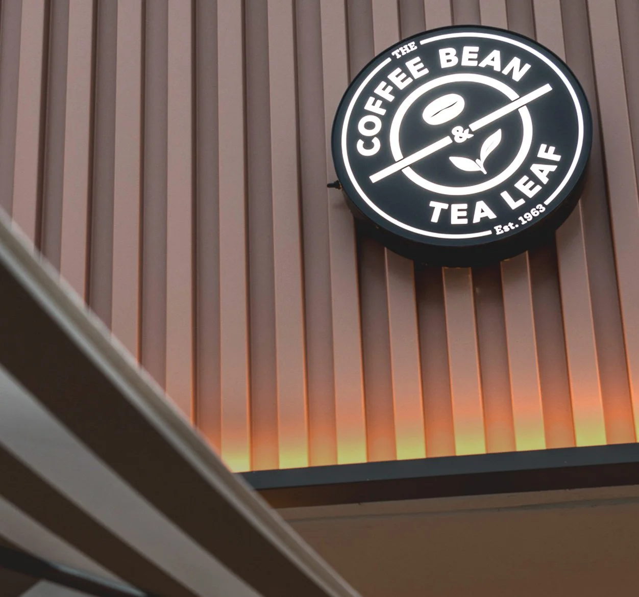
Rebranding The Coffee Bean & Tea Leaf meant rethinking every guest-facing and internal touchpoint—from sugar packets to store façades. Packaging, signage, uniforms, digital platforms, and brand systems. Every department was involved. Every department had a voice.
Some ideas are just too good to keep in the “Initial Round” folders.
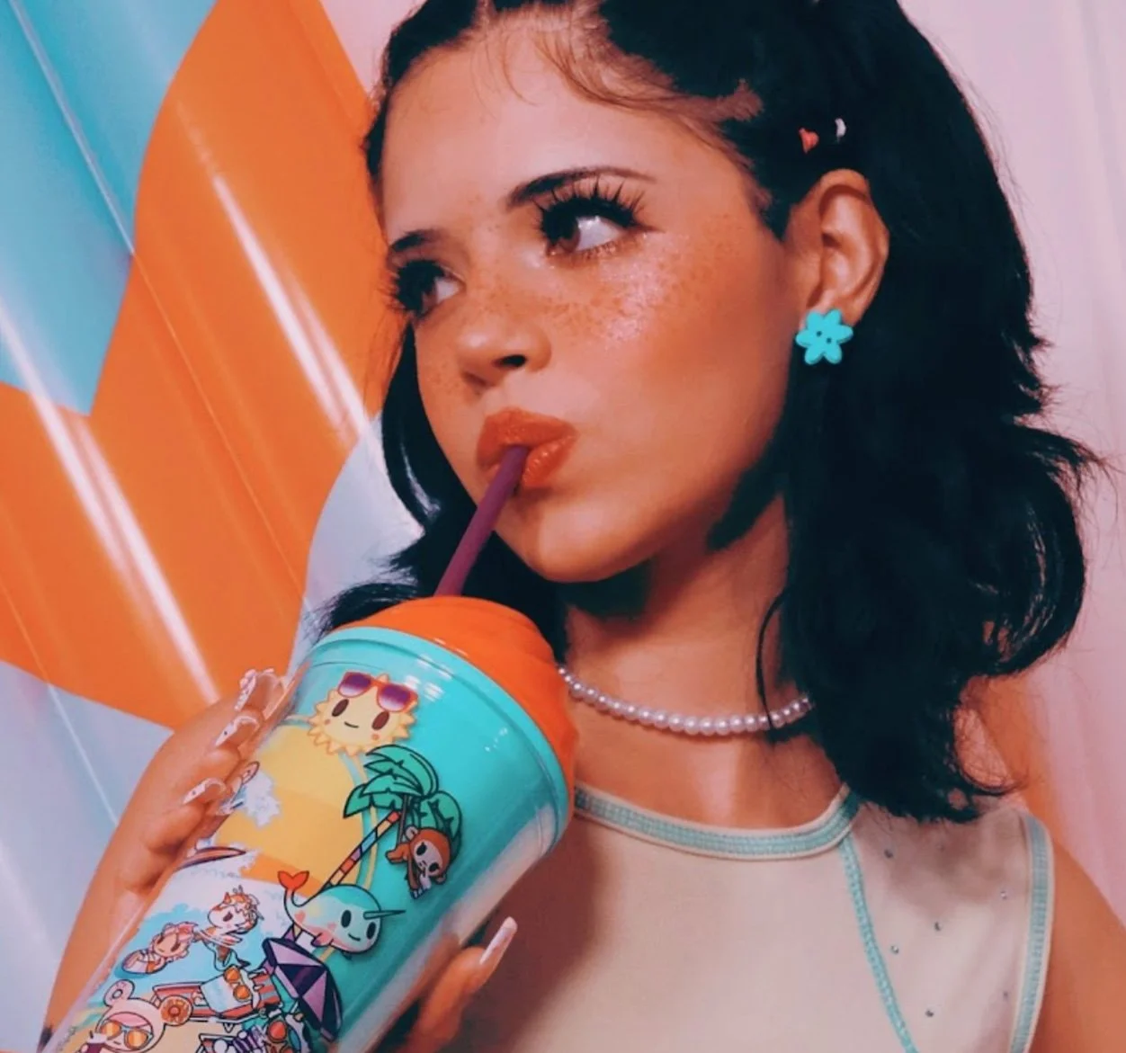
The tokidoki collaboration brought Simone Legno’s iconic illustrations to a custom line of The Coffee Bean & Tea Leaf merchandise—tumblers, key chains, bucket hats, and tote bags. I art directed and designed the campaign content supporting the launch.
Working closely with the tokidoki team and photographer @emilyeizen, we captured imagery with just the right edge of being authentic to tokidoki fans while staying true to The Coffee Bean brand.
Photographer: Emily Eizen
Results:
Collectible merch that felt equal parts fashion, fandom, and tokidoki culture. Sold out many items first week.
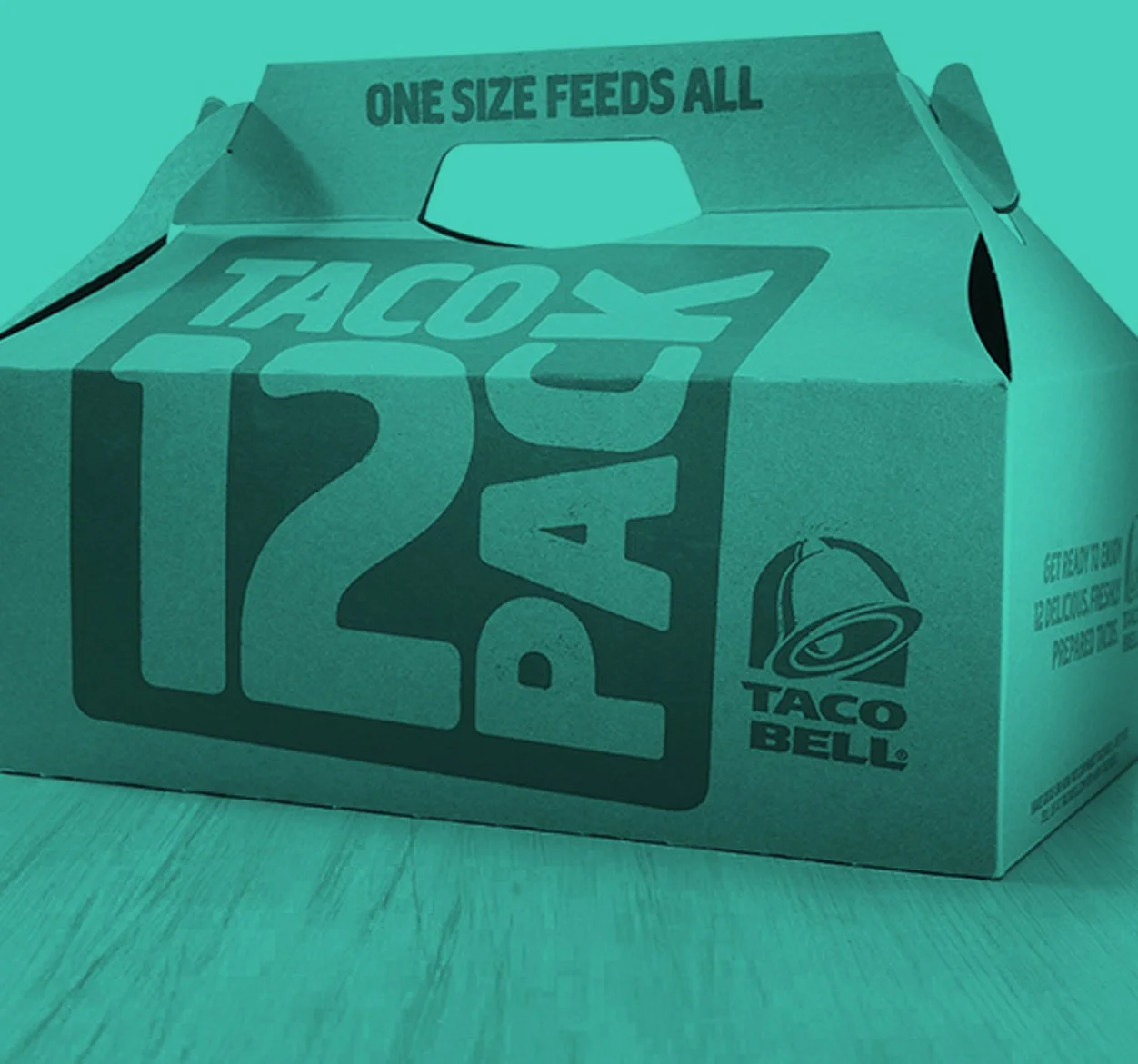
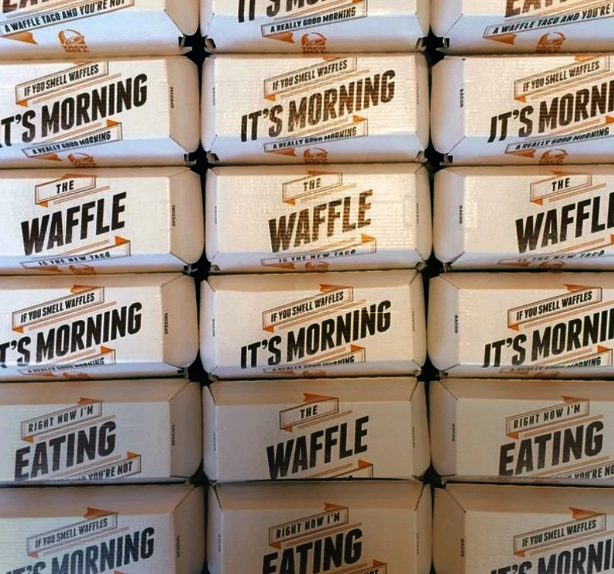
Breakfast Packaging for Taco Bell.
Taco Bell launched breakfast nationally for the first time, entering a market already positioned firmly with McDonalds and other QSR’s. A unique breakfast menu wasn’t going to be enough to make an impression, the Marketing team wanted breakthrough packaging that required more than just cool design, they wanted it to create social noise.
With that imposing obstacle we came to the realization that we had to design for the core demographic; those that were passionate, cultural followers of the Taco Bell brand.
WORD JUMBLE:
Each package, of the 21 variations, contains a different word. When the varying packages are placed next to each other it creates a unique word jumble. This sparked those sharable social moments. The design had cut through the clutter; it was loud, bold and photogenic from a 3” frame.
It was a proven success the day of the launch. People shared their first moments with images on Instagram, Tumbler, and Facebook–bragging of their breakfast experience at Taco Bell, with pictures of packaging and the P.O.P. to tell their stories.
An internal campaign built to motivate café teams through competition - race to 800 positive reviews. Locations competed head-to-head, tracking progress in real time.
The concept used F1 racing as the visual language: Buttons, posters, and a custom app let teams monitor their performance and see how other cafés stacked up.
Data concur that consumers are drawn to video, animation, Giff’s. To support their thirst, each season we crafted and create more to suffice their ravenous cravings.
CD: Jim Wylie
AD: Jessica Kaldem
The Nabi Line of Electronic Products for Kids
I wanted to tap into the mindset and the adventurous side of a kid. A little self reflection. The Nabi tablet allowed children to explore the world. Not taking them from reality but allowing them to be immersed in it. It’s a practical, day- to-day tool, designed and built for a kid.
Designer: Jim Wylie
The Coffee Bean Hook Book
This B2B brochure invites future franchisees inside The Coffee Bean & Tea Leaf—highlighting the brand’s history, community presence, and people-first culture.
CD: Jim Wylie
Designer: Katie Chappell
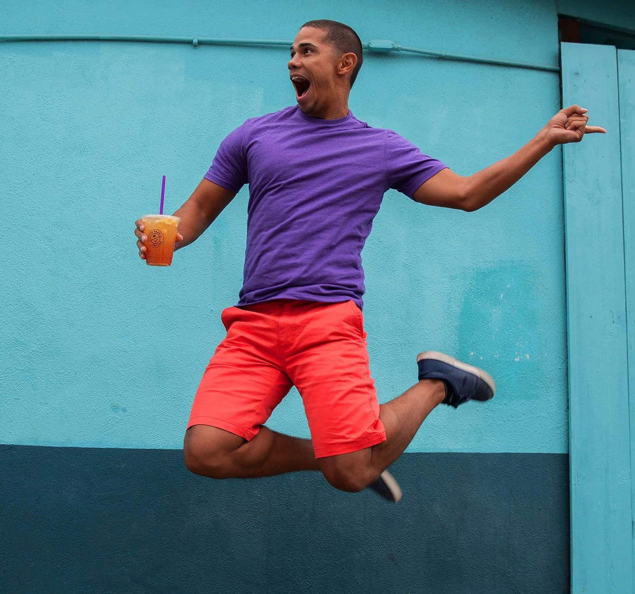
Lifestyle + Fashion + Food are all interconnected. Presenting the product is an easier, more relatable proposition when viewed through the lens of one’s life.
I love shooting products in a socially inviting environment. When on photo shoots I always schedule time between in studio products shots to capture lifestyle moments.
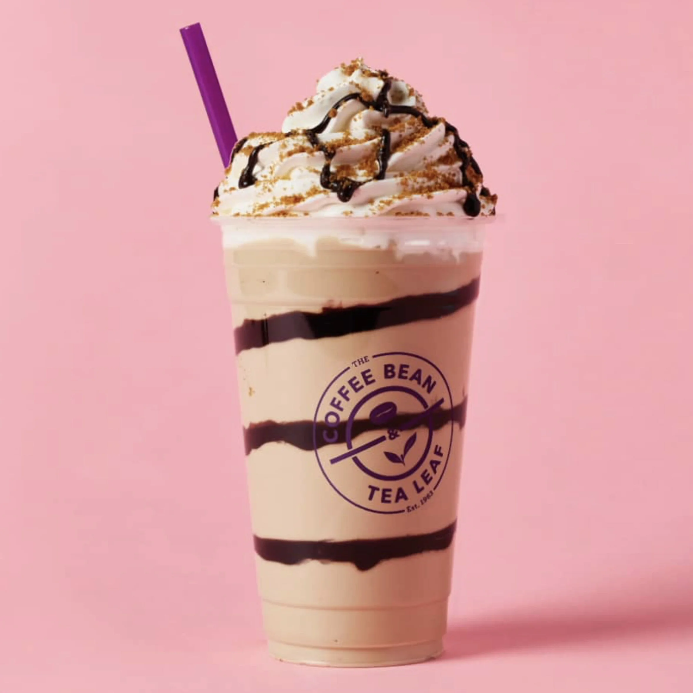
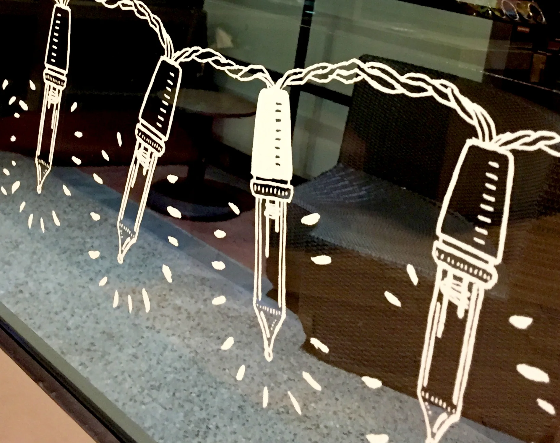
Our holiday season concept was Merry & Bright. To take on Starbuck’s “Red Cup” we built the brand around our “Purple Cup”. All the packaging, POP signs, interior signage, posters, gift cards, carried the theme of twinkle lights, gold and purple. We even placed actual twinkle lights in all the stores to really brighten up the holidays.
District and General Managers all agreed, we created one of the most cohesive and strongest holiday themed experiences they had seen. Overall 6% increase in beverage sales.
Photography: Trevor Pearson
Illustrator: Lauren Simken Berke
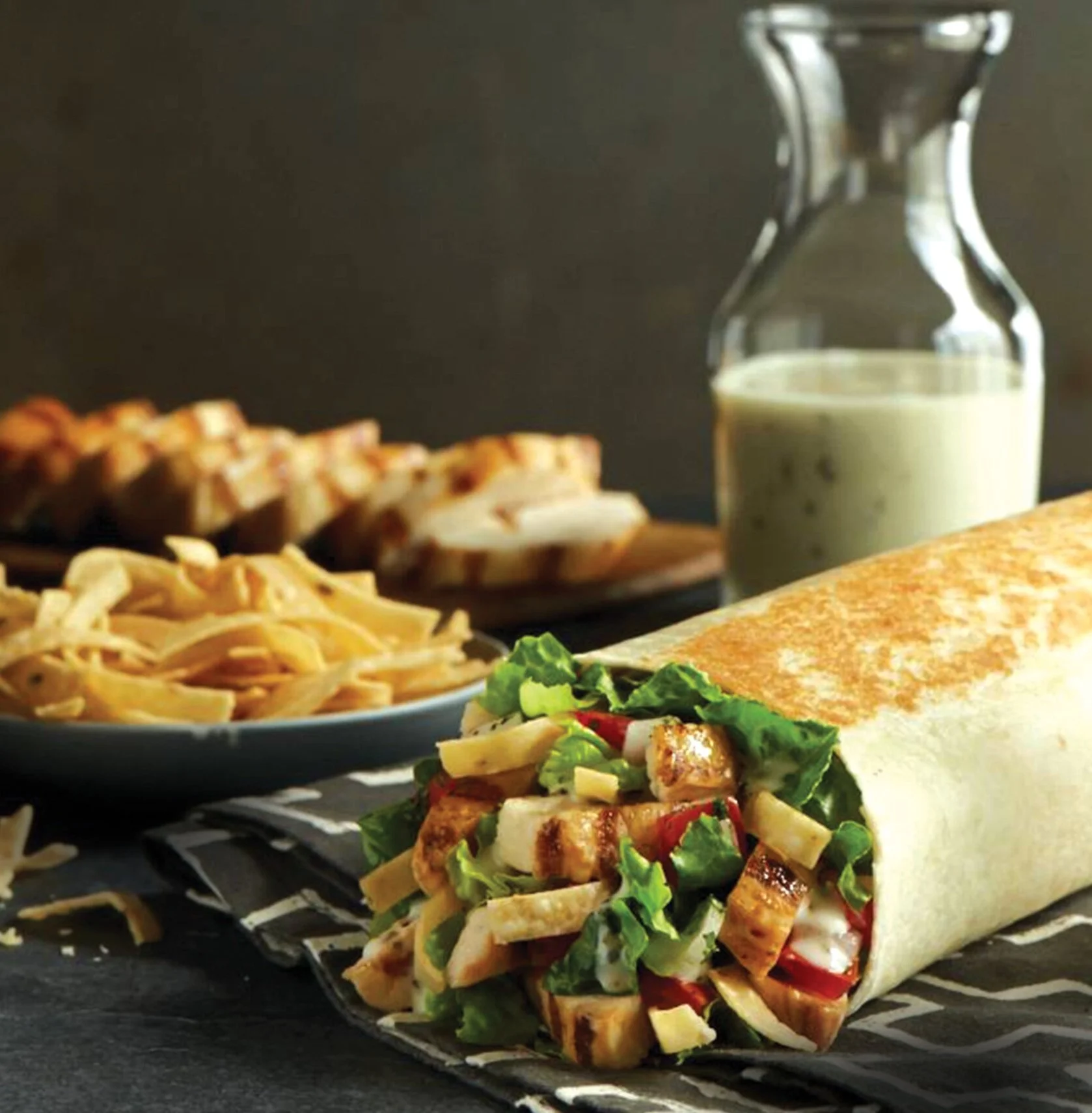
You taste with your eyes first.
In QSR, that matters more than ever.
You’re competing with cars moving at 40 mph and customers six feet from the menu.
Cars fly by. Lines move fast. Patience is gone.
I directed the photography and partnered closely with a copywriter to make every frame work harder. From a 99-cent taco to a nine dollar latte, the mandate stayed the same:
Stop people cold. Communicate instantly.
Deliver nothing but the best.
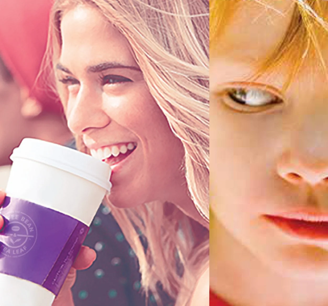
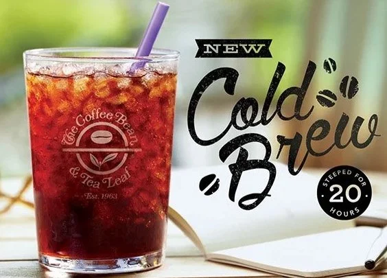
One of my first projects for The Coffee Bean, I felt this was an opportunity to bring lifestyle to a company traditionally focused on just the product.
The visual story was purposefully shot within a sun drenched setting and the use of hand-written type to add to that artisanal process of this coffee. There’s a reluctance to Cold Brew and lightening the mood helped ease the stigma of a coffee riffed with the notion of being “bold bitter”.
Sales of this new product showed so much success it has become a permanent item on the menu and since then we’ve added optional flavors and an extension of Cold Brew tea.
Typography: Shaina Gregory
Photography: Trevor Pearson
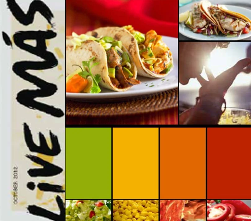
Taco Bell new tag line became Live Más. To support that new attitude and vibe we came up with in-store and team member activations. The Menu Board and interior design palette and Team Member uniforms.
This was one of my favorite projects to work on and the most well received by Taco Bell corp. The presentation was so well received I presented it 3 additional times to other departments.